.avif)


.png)

.png)


.avif)


...and why we'll (hopefully) never do it again.
The messy, ambitious, and very Plum story of rebuilding our website.
Our Pluming of Age Story
Every company has its coming-of-age moment. For Plum, it wasn’t a funding announcement or a headcount milestone. It was the moment we admitted our website no longer matched who we were becoming.
When we last redesigned the site, we were still a small, ambitious startup. We solved simple but very real issues for tech-first companies like us — dependents, endorsements, claims that didn’t make you cry. And our website reflected that energy. It was playful, warm and conversational, a friendly contrast to the jargon and fear tactics of traditional insurance players. It was stripped down and accessible, just like our product.
But we’ve grown.
We are no longer just the “group insurance people.” Plum has become a trusted partner for some of India’s and the world’s most valuable companies. We are solving enterprise-level challenges around employee health and well-being. Preventive and primary care. Liability covers. Even personal insurance for employees, or Plum members, as we call them. We aren’t just protecting people against emergencies anymore; we are helping companies build healthier workplaces end-to-end.
And yet, our website was frozen in time. And it wasn’t the only problem.
Over the last two years, we’d been making a few well-meaning changes to the website. In the pursuit of leads, this meant tradeoffs. A scrappily designed section here. A slight deviation from our brand principles there. A quick fix to our flow on the home page. All of these little things added up, and before we knew it, we were looking at a vastly different website.
The Greeks called it The Ship of Theseus – when you make so many fixes to something that you don’t know if there’s any original piece left.
The signals were everywhere:
- Conversion ratios had flatlined. Our sales team was busier than ever, but the website wasn’t keeping up. It wasn’t pulling its weight.
- Time-on-page refused to budge. A clear sign that visitors weren’t excited by what they were reading or seeing.
- Organic traffic lagged. We were growing as a company, but not as a brand people were discovering on their own.
- Content was stale. Our backlog of product updates kept growing, but our copy never caught up. We weren’t saying the things our users most wanted to hear.
- People pages lied. Our Careers section still showed team members who had long since moved on — a harsh but funny startup reality.
- Plus other metrics that I’m not willing to admit in public
The truth was unavoidable: Plum had matured, but our website hadn’t.
That mismatch between what Plum was and how Plum was presenting itself, was our Pluming of Age moment. And once you see it, you can’t unsee it.
We had to fix our Ship of Theseus, and we had to do it as it was sailing.
Piecing the Positioning
What would Andy Raskin or April Dunford do?
The subheading is mostly a joke for marketers. The truth is, we didn’t run some neat 5-step framework. A handful of us in leadership sat down and started wrestling with a deceptively simple question: what do we want Plum to say about itself now?
Between us, we’d seen benefits at some of the best companies in India and the world. We knew what “good” looked like. But we also knew Plum had to do better. That orthogonal view has always shaped how we work: less than 20% of our leadership comes from insurance. We’re not insiders polishing legacy playbooks. We’re product and business minds reimagining a centuries-old experience.
We borrowed inspiration from movements that set new benchmarks. Despite the many jokes on X about it, UPI is probably the last great one out of India: a payments experience so seamless, it made the world take notice. Our ambition was similar. Could Plum set the global benchmark for healthcare and insurance?
That’s why we obsess over NPS — something almost unheard of in insurance. Our claims experience scores 81 today. A good sign, but not the finish line. The real aspiration is for leaders at MNCs in India to tell their global counterparts: “The best benefits experience we’ve had was in India, with Plum.”
We also knew the kinds of businesses we wanted to serve. Companies that believe culture is built on care. Companies that know talent is their moat, and that the best talent doesn’t just deserve, but demands, the best benefits. For them, Plum had to be the default pick.
From there, the work turned tactical. We needed a line, not just a hero headline for the homepage, but a guiding principle for the redesign.
Some of the angles we explored looked promising at first but fell apart quickly. Product- and tech-first? That’s been a strong differentiator for us before, but it doesn’t capture who we are now. We’re an experience-led company, blending tech with human care. HR-first? Sure, HR is our primary ICP—we help them build, manage, and use their benefits—but that framing misses the last-mile impact, and frankly, anyone can claim it. Insurance claims is where people really feel the difference. But leaning only on claims would undersell our preventive and primary health promise. Startups? Too narrow. Contrarian stances? Not Plum.
That’s when I remembered something Gayatri Yadav once told me: truisms and tautologies be damned. Take a bold position even if it polarises. So we did. And we found our core message – we want to be the standard. Why else would we be here? :)
This is where things got… let’s say “spirited.” We debated dozens of options. We ran focus groups inside Plum. We swapped Google Docs full of drafts. And yes, we brought Gen AI into the room, not only to generate punchlines, but also to score them. At one point, we had a list of potential taglines, each rated on “effectiveness” and “distinctiveness” out of 10. (The AI’s judgment didn’t settle any arguments, but it gave us more to argue about.)

After rounds of back-and-forth, one line stood tall:
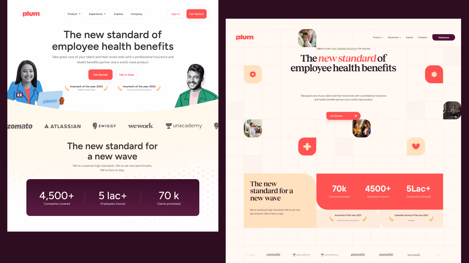
“Plum is the new standard of employee health benefits.”
It wasn’t just a tagline. It was the line. The story we wanted the world to hear, and the foundation for everything else in the redesign.
Calling in Reinforcements
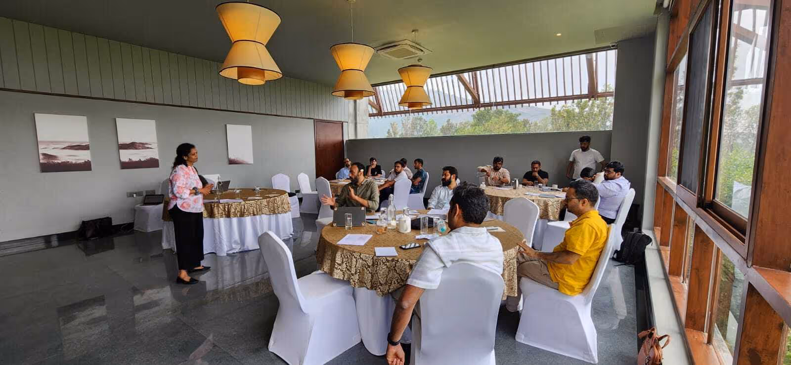
The website redesign was a leadership priority. The challenge was simple: picking this up with our best talent would mean a lot of BAU would take a hit, and we couldn’t afford that. Ownership wasn’t the issue. Bandwidth was.
We had content covered (thank you, ChatGPT). But we didn’t have the design or development bandwidth to pull off a full-scale overhaul. We still don’t. (P.S → we’re hiring).
This wasn’t our first time leaning on partners. Back when we undertook our major rebrand, we went in with clarity. We didn’t want just another agency that could churn out cookie-cutter B2B SaaS work. We wanted partners who could push us beyond the obvious. That is how we found Irregulars Alliance. The brilliant identity design they created, paired with the distinct illustrations by Mira Malhotra, gave Plum an identity that was warm, approachable, and playful in an industry drowning in corporate blues. The work stood out. It earned them a Blue Elephant at Kyoorius.
That experience set the standard. It taught us that the right partners not only make you look different, but also make you think different.
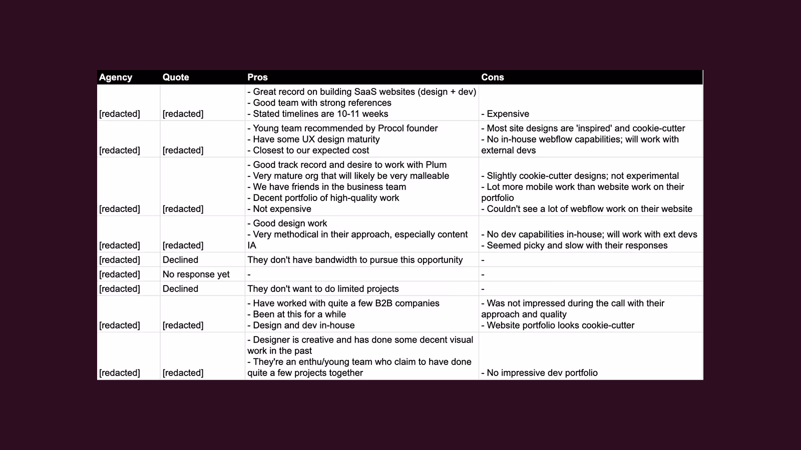
Similarly, this time around, we knew exactly what kind of partner we needed. Not the “safe” B2B choice. Not an agency that would hand us boilerplate layouts and call it a day. We wanted people who understood how aesthetics and experiences fuel brand. People who cared about finesse, and who would hold us accountable for giving them the right inputs.
After an elaborate search, complete with evaluation sheets, scoring, and plenty more debate, we landed on the wonderful folks at Epyc. From the start, they understood that this was about Plum's evolving design language rather than a new coat of paint. They had the craft, the patience, and the conviction to push us in the right directions.
With Epyc on board, the project finally had momentum. Positioning gave us the compass. Reinforcements gave us the legs to walk.
The Shape of Plum to Come
If positioning gave us the words, design gave us the mood.
Our early identity had already been shaped with care, and we wanted to evolve it without losing that DNA. This time, Prasun stepped in as custodian. Which in practice meant strong opinions, a monster moodboard, and the stamina to keep all of us honest when we were tempted to compromise.
His references came from everywhere: SaaS giants like Intercom and Mailchimp, envelope-pushers like Runway and Posthog, and completely left-field sources like German design studios and Swedish art museums. And it was everywhere too. Slack threads, shared docs, Pinterest boards. Just when you thought you had seen it all, Prasun would drop something new.
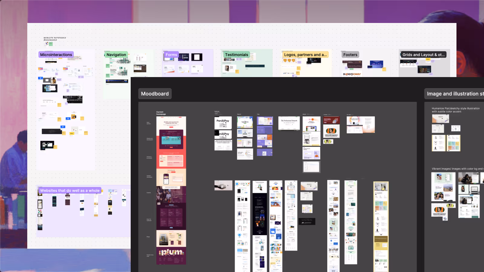
Interestingly, very few Indian companies made it into his list. But the ones that did happened to be in Epyc’s design portfolio. A happy coincidence, and maybe a sign we had chosen the right partner.
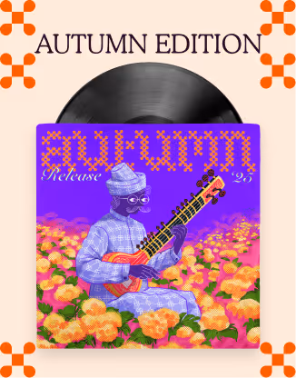
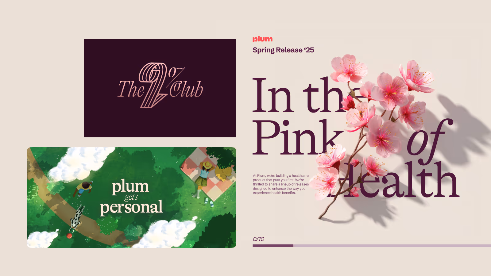
We weren’t starting from zero either. Our own campaigns had been small test beds for this shift. The 2% Club, Plum Personal, and our Spring Release all gave us experiments to learn from. Could we pull off serifs without looking stuffy? Could we broaden our colour palette without losing recognition? Could we move illustration styles into something more scalable? Each campaign answered a piece of the puzzle.
But this was nobody’s P0. Progress came in bursts. Weeks of debate and iteration, followed by weeks where BAU took over. Through it all, Prasun held the line. His role was less “design police” and more “cultural custodian,” reminding us what Plum should feel like in every frame and flourish.
Iteration after iteration, with Epyc’s steady craft and Prasun’s relentless eye, the new aesthetic took shape. Not playful for the sake of being playful. Not corporate for the sake of looking serious. Just Plum, grown up.
It’s Only Words
In every project there’s that one thing you assume will be easy. For us, it was content. We were wrong.
The backlog kept growing, and the pressure to get words on the page only mounted. In the end, desperation forced momentum. One day, Saurabh blocked time, rallied the team, and together we wrote content for 30+ pages in a single marathon sprint. Structures, drafts, revisions, all crammed into one day. Exhausting, but necessary.
This time around, we wanted to emphasize care and empathy even more than before. We had always stood for being simple, inclusive, and accessible. But now we wanted to make sure the human side of Plum — our obsession with customer experience and empathy — was clear on every page. That is why you’ll notice founder notes on Plum Care woven throughout the site.
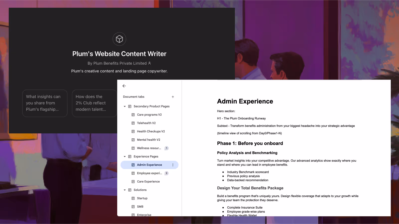
We didn’t do this alone. Our unofficial fifth team member was a custom GPT, created by Arijit and Saurabh, that acted like another writer in the room. It suggested drafts, scored versions, and nudged us when we drifted off-message. But if the AI gave us scale, our content team gave us standards. Asawari in particular spent the following week polishing everything, making sure it fit our brand tone and voice while also adhering to the design constraints.
The sprint got words on the page. The edits made them Plum.
Lorem Ipsum Color Wit Beget
With the words in place, the waiting began. Webflow builds don’t happen overnight. For weeks, our “new website” looked like a graveyard of grey boxes and Lorem Ipsum. Placeholder purgatory. Every review call felt the same: layouts were taking shape, but the art was still a question mark.
What we wanted was clear: an art style that felt on brand and could actually scale. Easier said than done. We love our illustrations. Prasun had literally won a Kyoorius Blue Elephant for ESOP’s Fables earlier this year. But he and Gayathri knew that creating more than 70 unique illustrations just for the site would break us.
So we stood at a fork. Keep the human face of Plum. Keep doing bespoke illustrated work. Or evolve into something that gave us speed, efficiency, and consistency.
The answer was obvious. Campaigns and assets could still go all out on craft. But for the website, our always-on identity, we needed something scalable.
So Prasun and Arijit did what the duo always do — they obsessed. Ten days and three credit top-ups later, they cracked it. The perfect SREF for Midjourney. At last, we had an artwork style that looked like Plum, played well with our product visuals, and could be generated at scale.
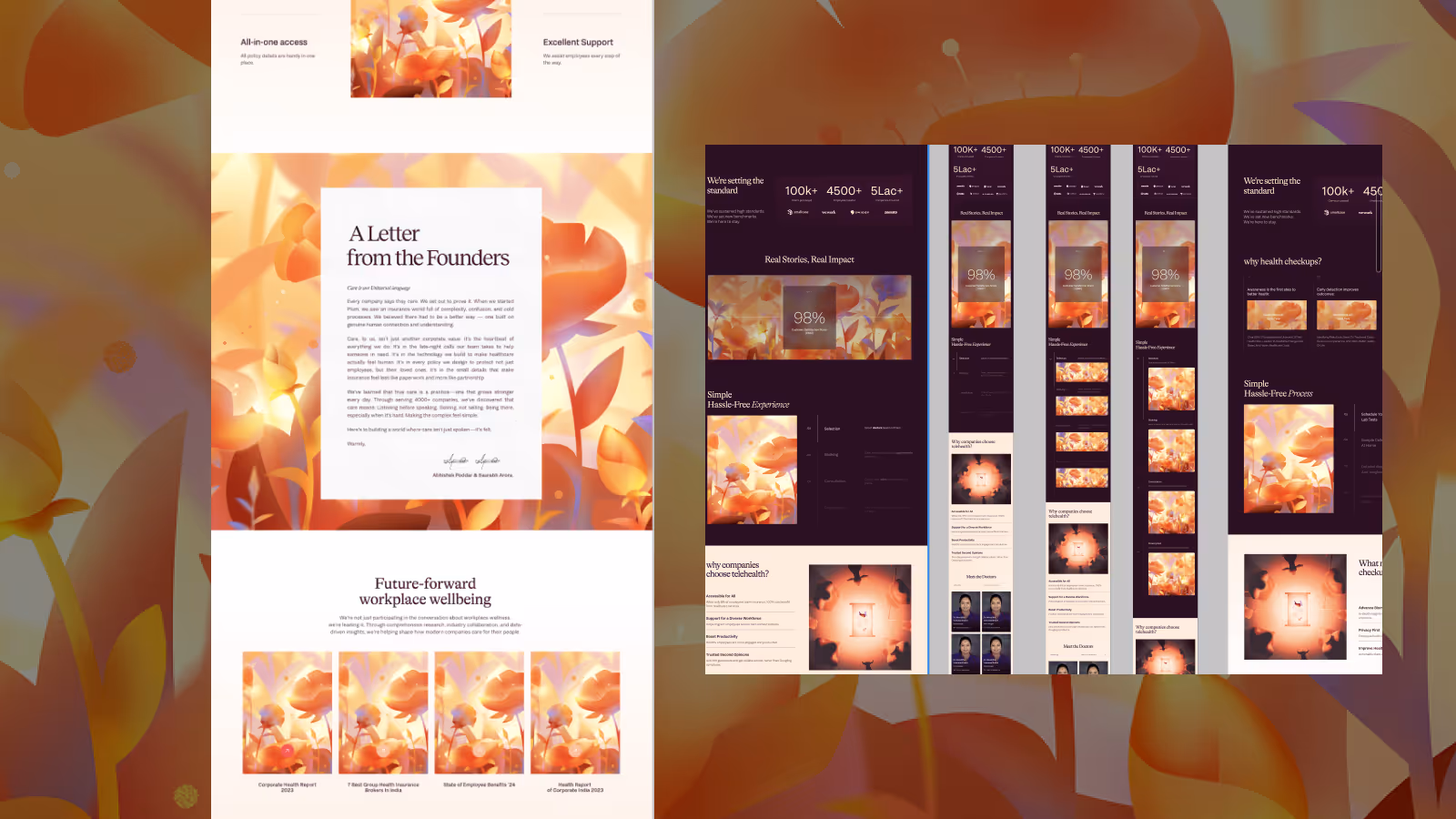
The interplay of art and product became our backbone. The placeholders finally disappeared. What we had instead was a site that felt crafted and future-ready in equal measure.
We Ship Bold Ideas and Unfinished Websites
The agency had done their bit. Layouts ready. Design language in place. Pages waiting to be filled. But the truth was, we weren’t anywhere near done.
We still didn’t have our full bank of 70+ visuals. The copy needed polishing. Out-of-scope pages had to be migrated. SEO fixes were hanging. Integrations with CRM and other tools were untouched. And the kicker: we didn’t even have an in-house Webflow developer to stitch it all together.
The project had already dragged on longer than it should have. Deadlines blurred into each other. Placeholder art stared back at us. It was a half-built house, and we were running out of patience.
So we did what we always do when stuck. We brought in more reinforcements. A second partner to take us across the line. And more importantly, Sharvan.
If you know Plum, you know Sharvan. Today he’s a growth engineer building AI projects. Before that, he was the single owner of our website inside marketing. He knew every quirk, every shortcut, every limitation Webflow could throw at you. He also had the rare superpower of being as detail-obsessed as a designer while moving as fast as an engineer.
He took over. He broke the chaos into a clean, phase-wise plan. He pushed, pulled, and shipped. Three weeks later, we had a website. Real, production-ready, live.
But shipping was only half the story. Yes, the site was live. Yes, we got compliments. But our obsession with craft and delight was far from satiated. We didn’t set out to build a website that simply works. We don’t want to be just another functional asset that sits neatly alongside other insurtech or SaaS sites in India. Our ambition is much bigger than that.
We want to be the standard for websites anywhere in the world.
Because why shouldn’t a healthcare and insurance company be the one to set the bar? Why shouldn’t reading about dependents, claims, and liability insurance be as joyful, seamless, and unexpectedly delightful as exploring the world’s best consumer products?
There is still so much scope. Copy that can surprise you. Interactions that can put a smile on your face. Micro-moments of design that make you pause, even while you’re reading about something as complex (and yes, sometimes boring) as insurance or healthcare.
The launch gave us the foundation. But the polish, the delight, the unexpected moments of joy — that’s what will make this site truly Plum. And that’s the part we’re not done with. We ship bold ideas and unfinished websites, but never unfinished craft.
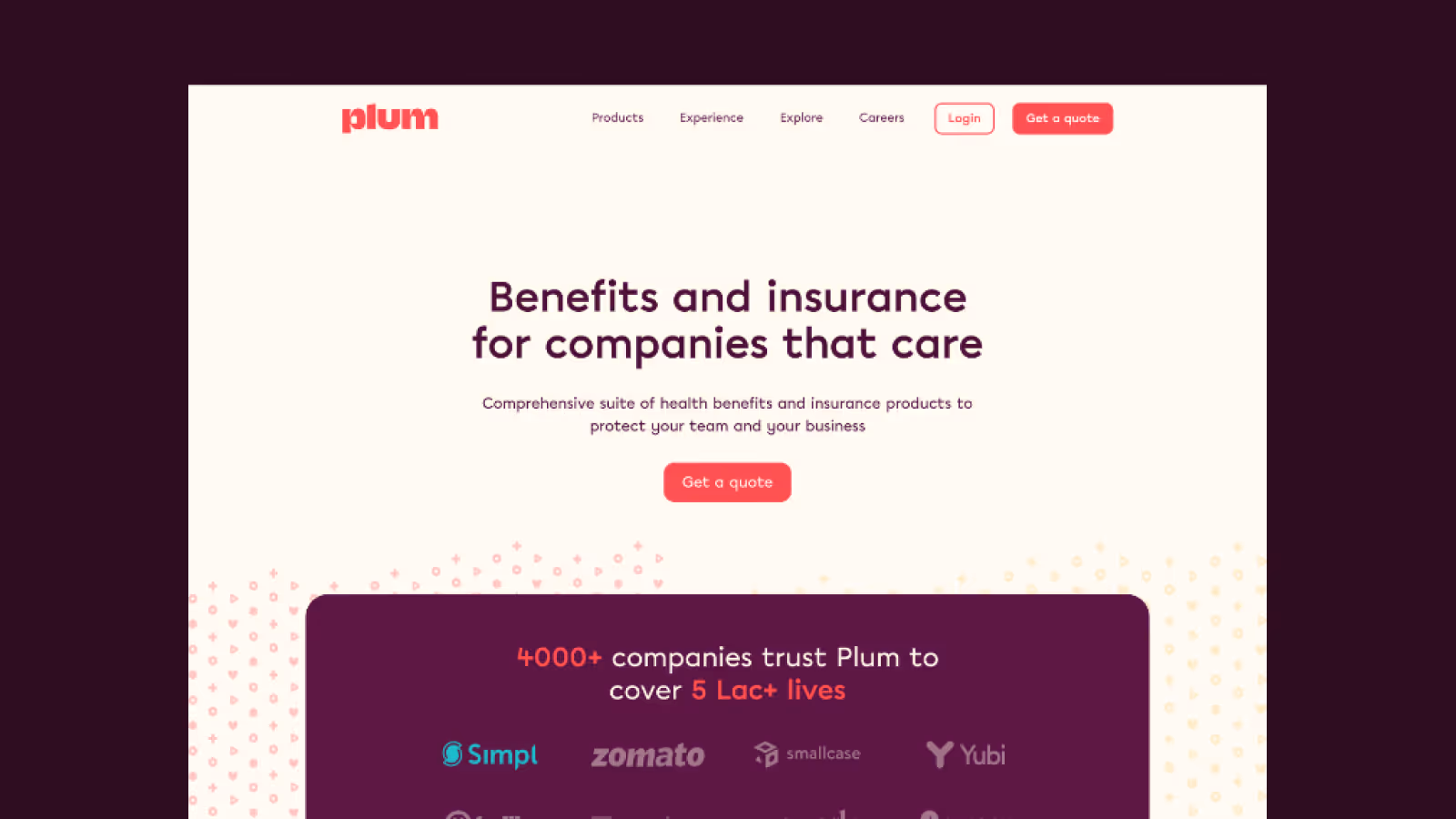
Take a look at our new website :)
.avif)
What Building Yet Another Website Taught Me About B2B Marketing
The site is live, and we’re proud of it. But more than anything, this project taught me something about B2B marketing itself.
For decades, websites in our world have been little more than digital brochures. You assemble your best qualities, line them up across pages, and hope a visitor pieces together what matters to them. If they find what they need, you’ve done your job. If they don’t, well, good luck next time.
That model is running out of time.
I’d wager this is the last generation of brochure-style websites as we know them. The next wave will not be static. It will be contextual. It will be personal.
At Plum, we already imagine a future where the basics are enough to generate something tailored. A single detail, like an email, tells us enough about a visitor’s company to frame the story in a way that matters. A CFO would see the financial impact. An HR leader would see the culture of care. A founder would see how Plum scales with their org.
That’s where we’re headed. Not brochures. Not navigation trees. Real experiences, built in real time, that meet people where they are.
Which is why I believe this will be the last traditional website I’ll ever build. The next one won’t be about showing everything to everyone. It will be about showing the right thing to the right person at the right time.
We don’t want to fix another Ship of Theseus. We want to build The Argo.
And if building that excites you, write to us at marketing-hiring@plumhq.com.
.avif)